Broadcasting
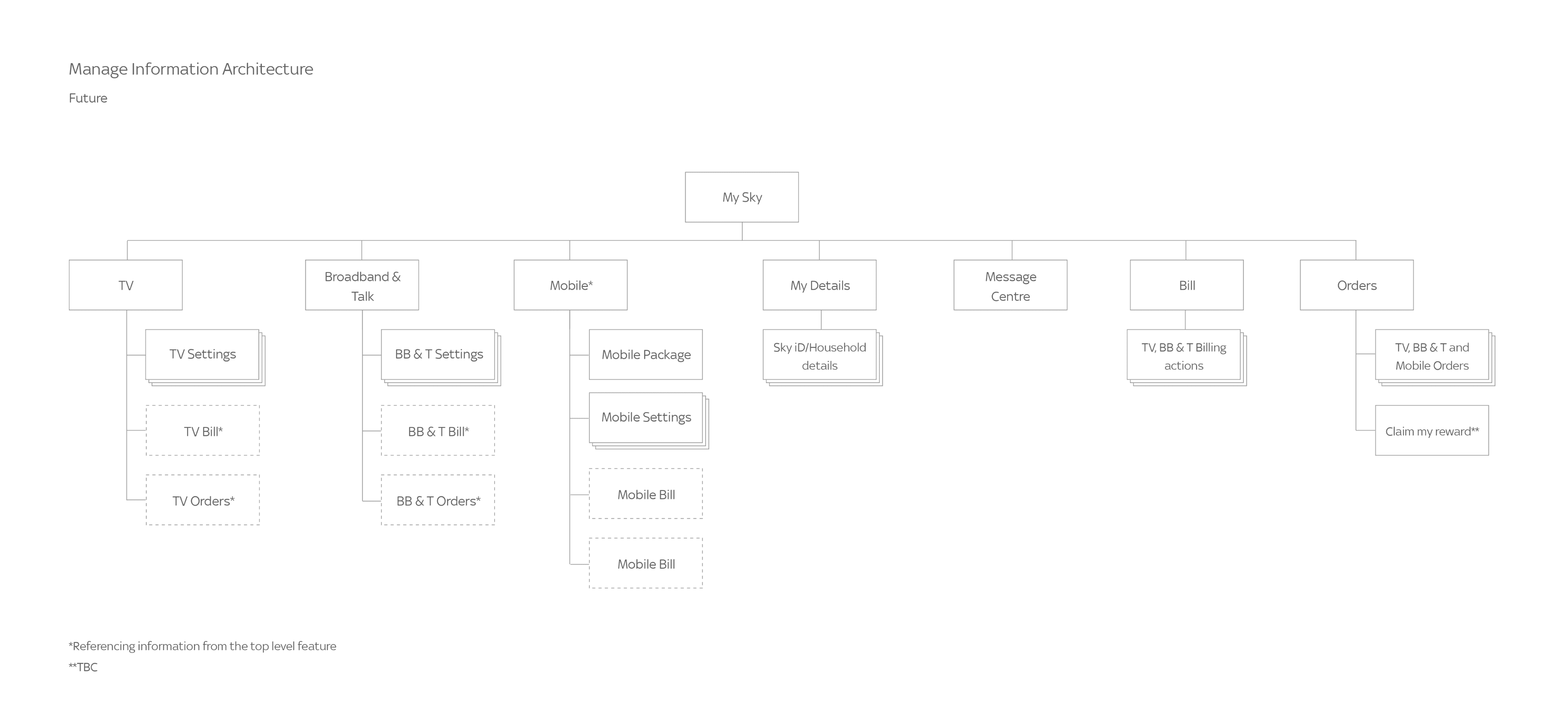
Making it Easier for People to Manage Their TV and Broadband Products
Increasing online self service and reducing customer calls by 10%
Role
UX Designer
Company
Sky
The challenge
Sky customers are often looking to make changes to their packages, and as a result can spend a long time speaking with advisors over the phone, resulting in long wait times and unnecessary frustration.
The goal for this project was all around call deflection. A reduction in customer queries coming into the call centres would provide an indication that people were getting the answers they needed elsewhere.
The process
Customer journey review
To better understand the needs and goals of our key users, I conducted a number of research activities including:
Customer call centre call listening
User bevahiour data analysis
NPS survey comments
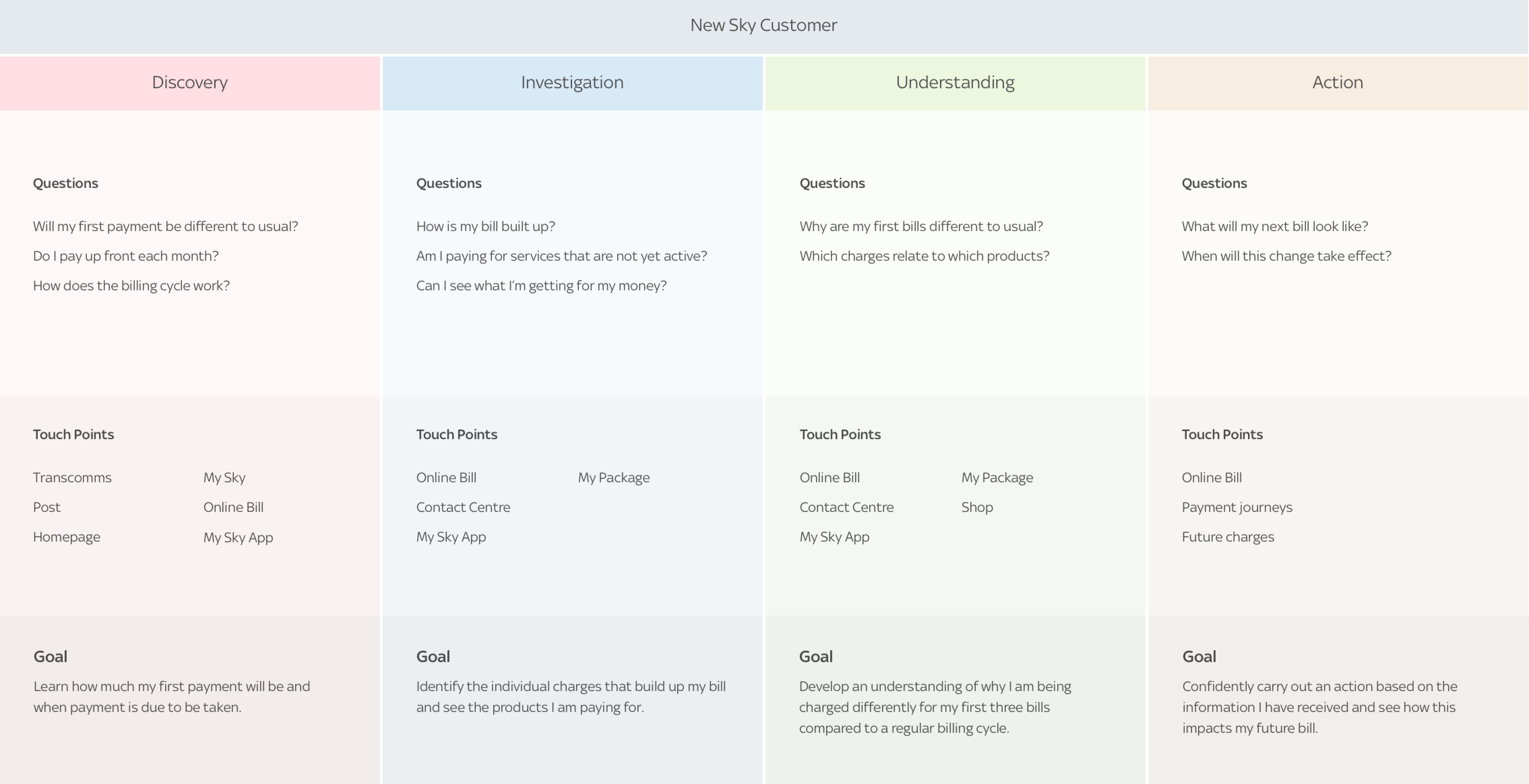
To solidify the insights gained and share this with the team, I translated the findings into a number of artefacts, with the new customer journey map being a key output that helped us move forward with accurate data.
To make this user journey easy to understand for as many people across the company as possible, I established the 4 phases that a new Sky customer would typically go through.
Putting it all together
Common pain points
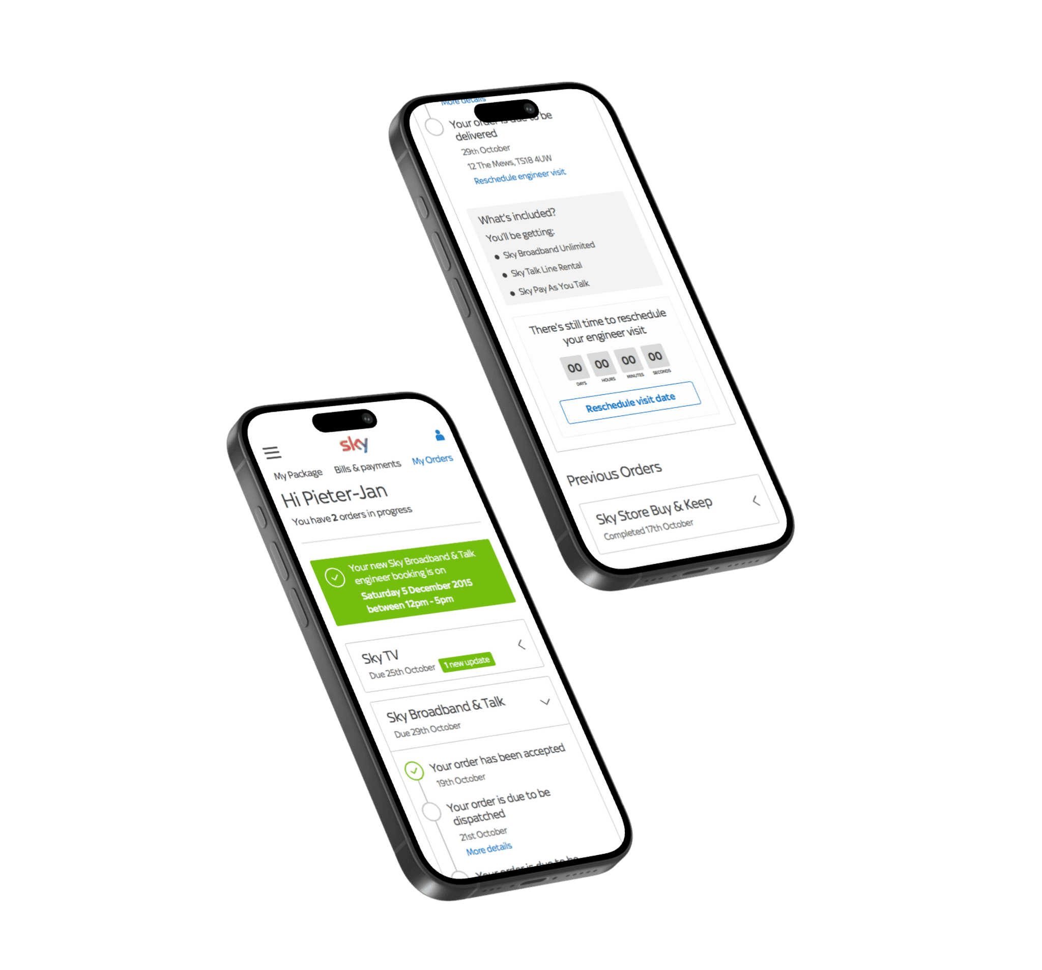
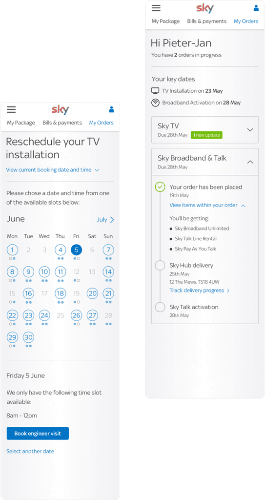
Through the research, we identified that one of the most common reasons people call up is to get updates on their orders. This includes new TV and broadband services that are yet to go live, as well as physical home equipment.
Closely related to this, we saw an increasing trend of people needing to reschedule their engineer visit to install the equipment.
Engineer rescheduling journey
At the time, there was no way for people to change the delivery and installation dates online.
This was a great opportunity for us to inroduce new digital, self servce capabilities while having a potentially significant impact on the satisfaction of our customers.
Design iteration
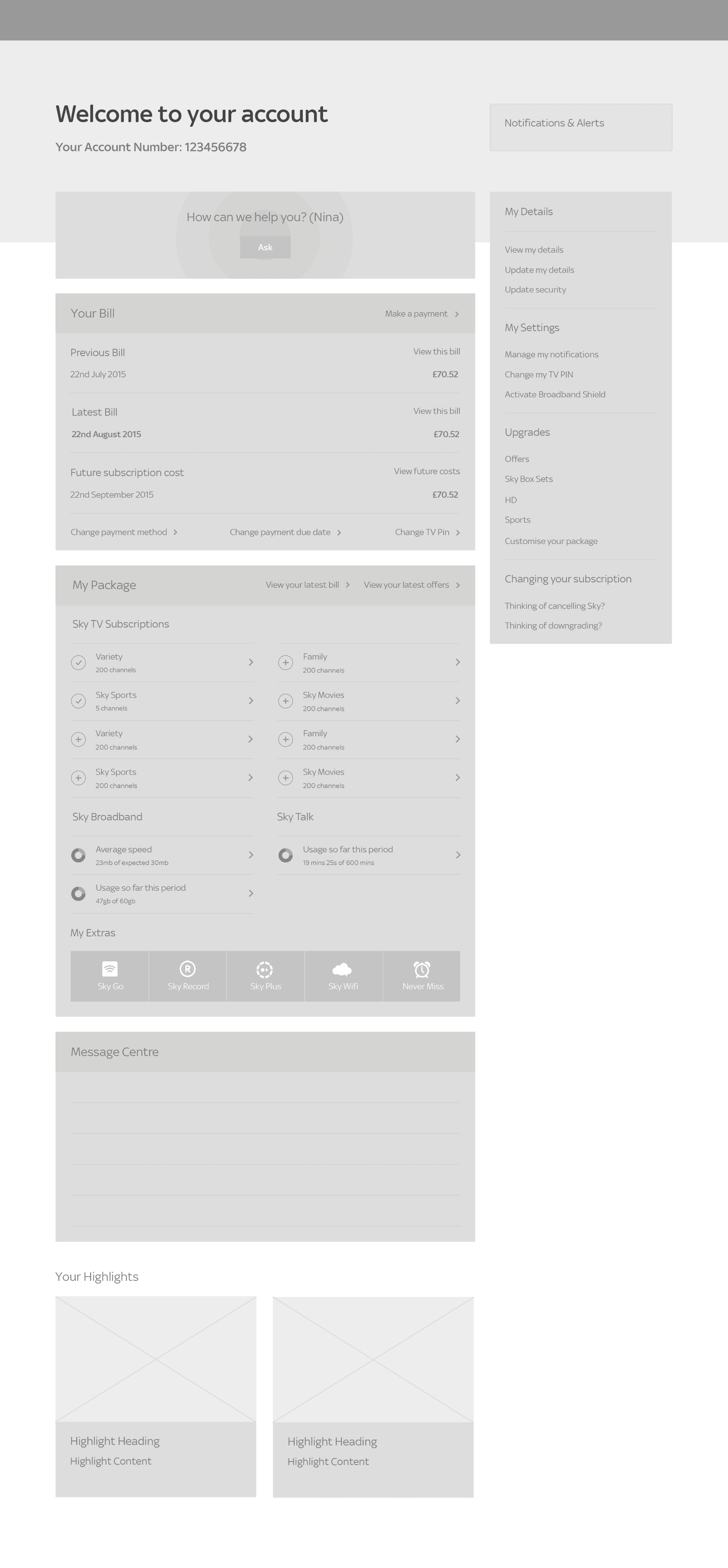
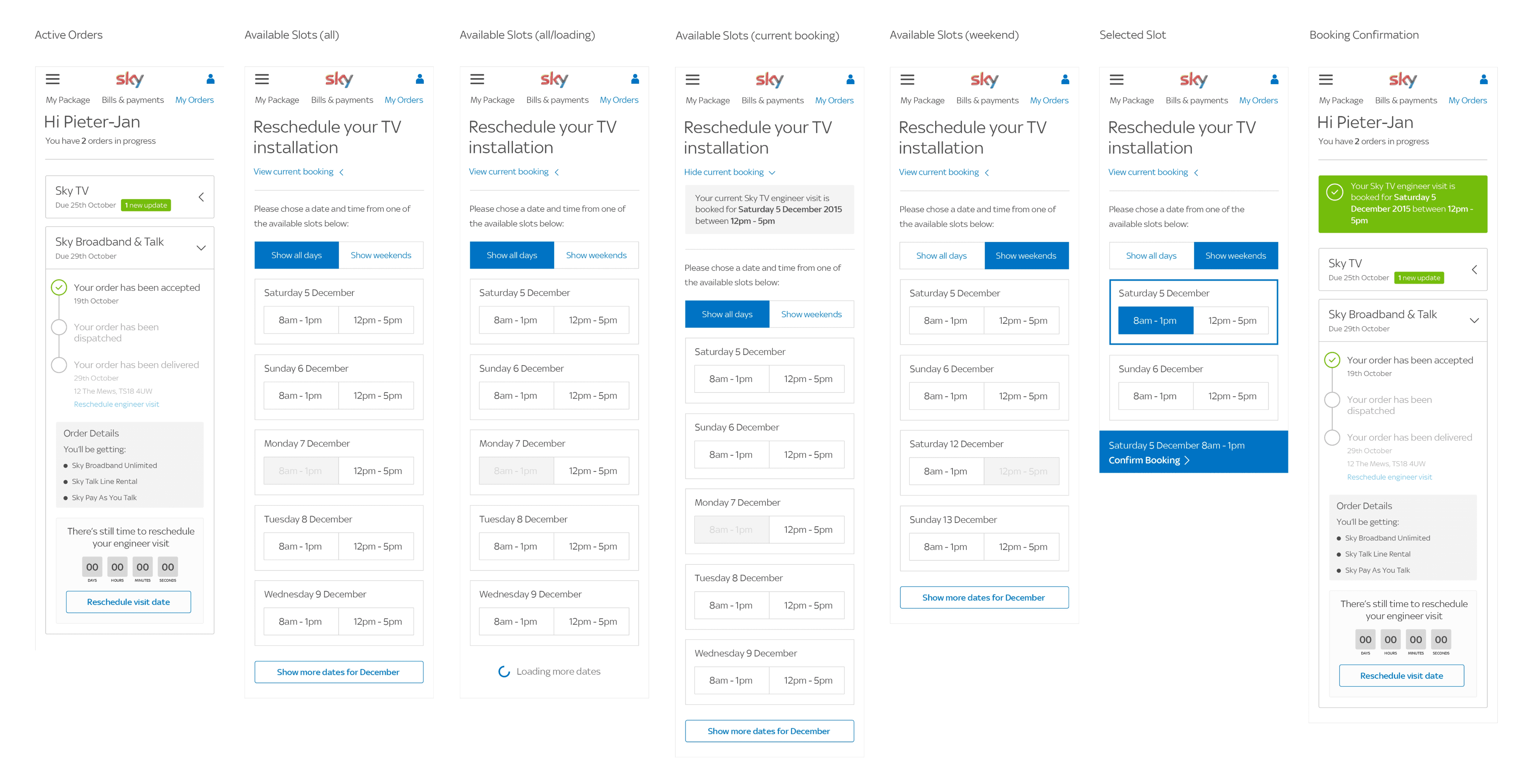
It was key that we explored multiple directions for this journey, trying out both existing components and new interactions.
With the consistent goal of making it as clear as possible to make sense of status updates and then make any required changes to the installation date, keeping the design minimal and familiar was essential.
After testing each approach with users who fit the persona of a new customer, the most effective design direction became clear.
The solution
The design direction that we released to the public focused on the most common behaviour we'd previously noticed during research. The vast majority of people wanted to filter available dates by weekdays vs weekends, and morning or afternoon slots.
To help with this, large, unmistakable tap areas and supportive helper text were key areas components of the experience.
Given the number of drop offs we noticed in the previous version, keeping people focused on completing their task and submitting the request within a single page experience was the approach we took. A minimal visual design coupled with clear selected states provided to be effective, all while aligning with the Sky brand aesthetic.
Outcomes
Over 10% reduction in calls relating to installation rescheduling
Increased adoption of the Order Tracking online service
A noticeable increase in the mobile device usage of sky.com
“Tim has a remarkable level of thoughtfulness and empathy in his approach to design, he was one of my go-to people and I've always found his insights and contributions to be immensely valuable.
Tim showcases a strong growth mindset that will benefit any client that is focused on crafting exceptional customer experiences.”

Chris Compston
Product Strategy Leader
